Scientists working in exercise physiology often design experiments containing repeated measurements on different athletes or participants over the course of time.
One example, in a sport science setting, is the monitoring of a team-sport athlete’s response to training and competition loads. The countermovement jump (CMJ) is used to monitor an athlete’s neuromuscular status. A CMJ will often be performed by an athlete prior to training or match and monitored over the course of a week, tournament or season.
To show how repeated measures data can be analysed and visualised in R, I have created a (hypothetical) example of different athletes performing two trials of a CMJ at two different times of the day and monitored over a three day period. I have chosen Peak Velocity as my dependent variable purely for display purposes only. A useful variable to monitor the neuromuscular status of Australian Rules athletes appears to be Flight Time:Contraction Time.
Athletes = c("Gus", "Hudson", "Bobby", "Tom", "Jessie")
# CMJ performed at two different time points
TimeOfDay = c("AM", "PM")
# Set the start date of data collection
StartDate = as.Date("2016-02-01")
# Set the seed, to reuse the same set of random variables
set.seed(60)
# Create a data.frame containing dummy raw CMJ data
CMJRawData = data.frame(Name = rep((Athletes), each = 4),
Day = rep((weekdays(StartDate + 0:2)), each = 20),
Trial = as.numeric(rep(1:2, each = 1)),
TimeOfDay = rep((TimeOfDay), each = 2),
PeakVelocity = runif(60, 1.5, 2.8))
Plots can be created in R using the base packages however, I prefer to use ggplot2 due to it’s easy to follow syntax and ability to create complex figures in a visually pleasing manner. This package will need to be installed into R prior to loading.
# Load the required ggplot2 package
require(ggplot2)
# Create a basic box and whisker plot to visualise Peak Velocity
ggplot(data = CMJRawData, aes(x = Day, y = PeakVelocity)) +
 geom_boxplot(aes(fill = TimeOfDay))

The above plot is OK however, I personally prefer a cleaner plotting background plus emphasised ticks and correct axis labels. The code below creates a much more visually pleasing plot that can be used for presentation or scientific purposes.
# Create a neater looking plot with correct scientific notation
ggplot(data = CMJRawData, aes(x = Day, y = PeakVelocity)) +
geom_boxplot(aes(fill = TimeOfDay)) +
ylab(expression(Peak ~ Velocity ~ (m.s^-1))) +
scale_y_continuous(expand = c(0, 0), limits = c(0, 4)) +
theme_classic() +
theme(legend.title = element_blank(),
legend.text = element_text(size = 13),
strip.text.x = element_text(size = 15, face = "bold"),
axis.title.x = element_blank(),
axis.text.x = element_blank(),
axis.line.x = element_blank(),
axis.ticks.x = element_blank(),
axis.title.y = element_text(color="black", size = 15, vjust=1.5),
axis.line.y = element_line(colour = "black"),
legend.position = "bottom") +
facet_wrap(~ Day, scales="free_x")

I found the above plot much easier to read. The labels or ticks can be highlighted by including face = “bold” where appropriate. The y-axis scale can also be adjusted to zoom in on the figure and lose the white space by simply configuring the line:
scale_y_continuous(expand = c(0, 0), limits = c(0, 4))
To obtain summary statistics for a repeated measures dataset, install the package “psych” into R and run the following code. Other statistics, including the SE, can also be obtained by substituting “se” for “sd” in the line of code below.
# Load the required package
require(psych)
# Obtain the Mean and SD for Peak Velocity, over each day and time of day
PeakVelocity = ddply(CMJRawData, c("Day", "TimeOfDay"), summarise,
Mean = mean(PeakVelocity),
SD = sd(PeakVelocity))
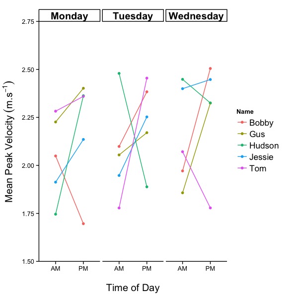
Of interest to many scientists and practitioners is the individual response to training. This can be calculated and plotted using the code below, to track athletes over time. Note: I have calculated a mean Peak Velocity measure from the two trials at each time of day.
# Calculate the Mean and SD for Peak Velocity, for each athlete, over each day and time of day
PeakVelocityIR = ddply(CMJRawData, c("Day", "TimeOfDay", "Name"), summarise,
Mean = mean(PeakVelocity),
SD = sd(PeakVelocity))
# Plot individual responses across time for each day
ggplot(data = PeakVelocityIR, aes(x = TimeOfDay, y = Mean, colour = Name, group = Name)) +
geom_point() +
geom_line() +
ylab(expression(Mean ~ Peak ~ Velocity ~ (m.s^-1))) +
xlab("\nTime of Day") +
scale_y_continuous(expand = c(0, 0), limits = c(1.5, 2.75)) +
theme_classic() +
theme(legend.text = element_text(size = 13),
strip.text.x = element_text(size = 15, face = "bold"),
axis.title.y = element_text(color="black", size = 15, vjust=1.5),
axis.title.x = element_text(color="black", size = 15),
axis.line.y = element_line(colour = "black")) +
facet_wrap(~ Day, scales="free_x")
Individual responses can also be displayed with a mean or group average overlay. This is displayed below.
# Create a new column, called name, for plotting
PeakVelocity$Name = c("Average")
# Plot the individual responses plus means
ggplot(PeakVelocity, aes(x = TimeOfDay, y = Mean, group = Name)) +
geom_point(colour = "black", size = 4) +
geom_line(colour = "black") +
geom_point(data = PeakVelocityIR, aes(x = TimeOfDay, y = Mean,
group = Name, colour = Name)) +
geom_line(data = PeakVelocityIR, aes(x = TimeOfDay, y = Mean,
group = Name, colour = Name)) +
ylab(expression(Mean ~ Peak ~ Velocity ~ (m.s^-1))) +
xlab("\nTime of Day") +
scale_y_continuous(expand = c(0, 0), limits = c(1.5, 2.75)) +
theme_classic() +
theme(legend.text = element_text(size = 13),
strip.text.x = element_text(size = 15, face = "bold"),
axis.title.y = element_text(color="black", size = 15, vjust=1.5),
axis.title.x = element_text(color="black", size = 15),
axis.line.y = element_line(colour = "black")) +
facet_wrap(~ Day, scales="free_x")

The above is only a sample of how repeated measures data can be visualised. What methods do you use to display repeated measures data? How do you clearly communicate individual responses?

Hi there, thanks for the excellent sharing! It came at a good time as I’m now learning R to run some non-parametric ANOVA on my research work. I find the individual responses plot very useful and applicable, especially with the group mean overlay!
I’ve been using Ms Excel to do many of my research data plots. Your post may change my habit, that is if I’m able to overcome the steep learning curve of using R!
Cheers
LikeLike